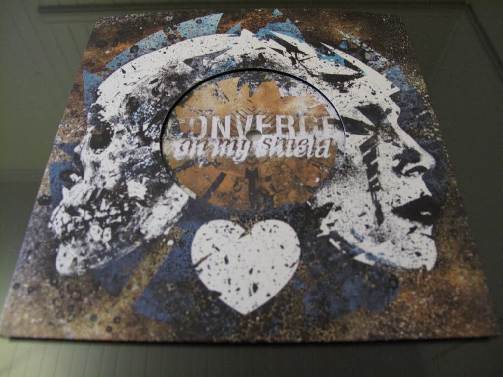
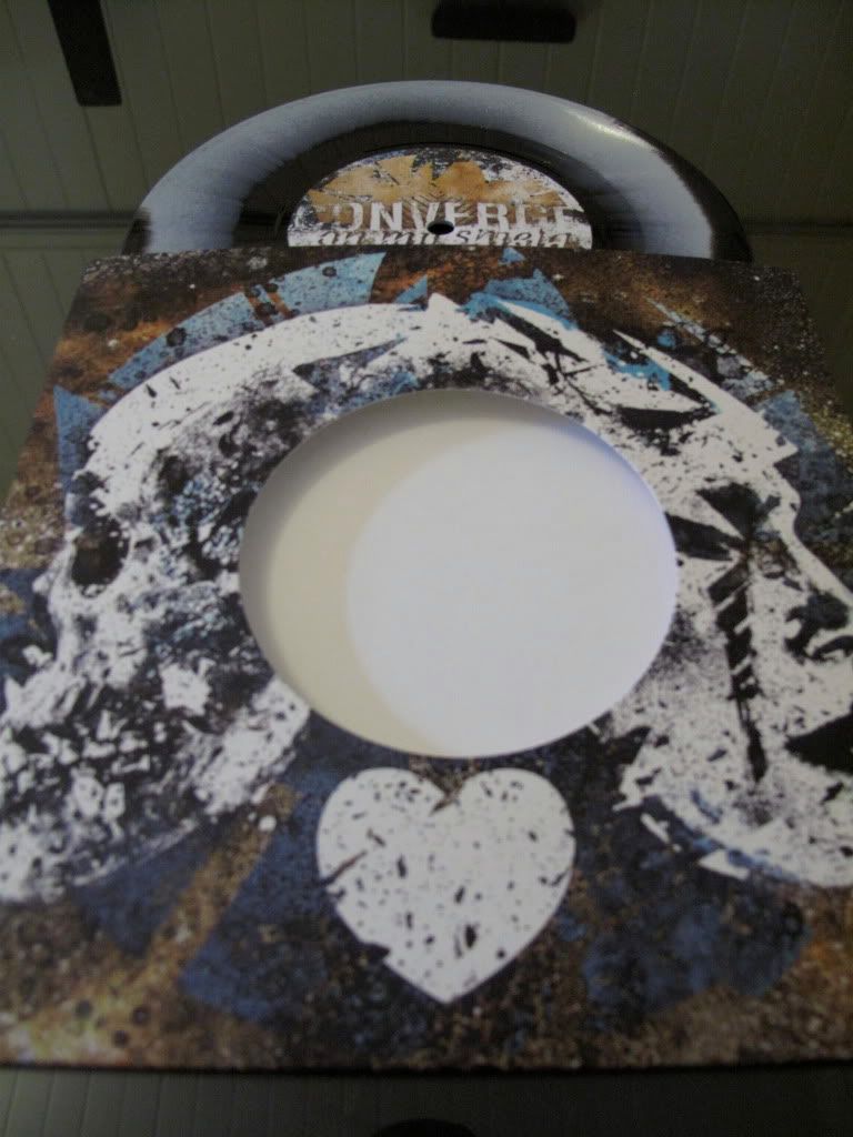
A nice, clean, glued closed sleeve on thick card, with a 45 style hole.
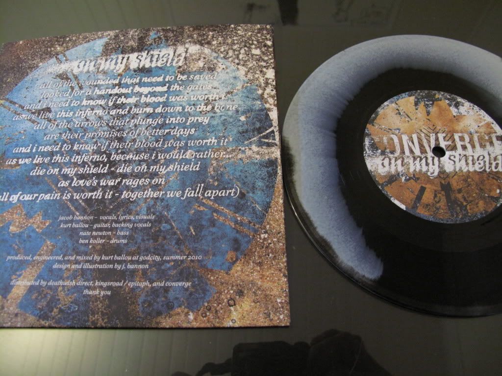
 No inserts. All relevant information and the lyrics to the song are printed on the back. 3000 copies of this record were pressed, spread over three alternate colourways. 1000 for their recent european tour, 1000 for various distros around the world, and 1000 that were made available in the bands online store. I think that's how it went anyway? My copy is of the 1000 from their store. Black and white smudge type wax.
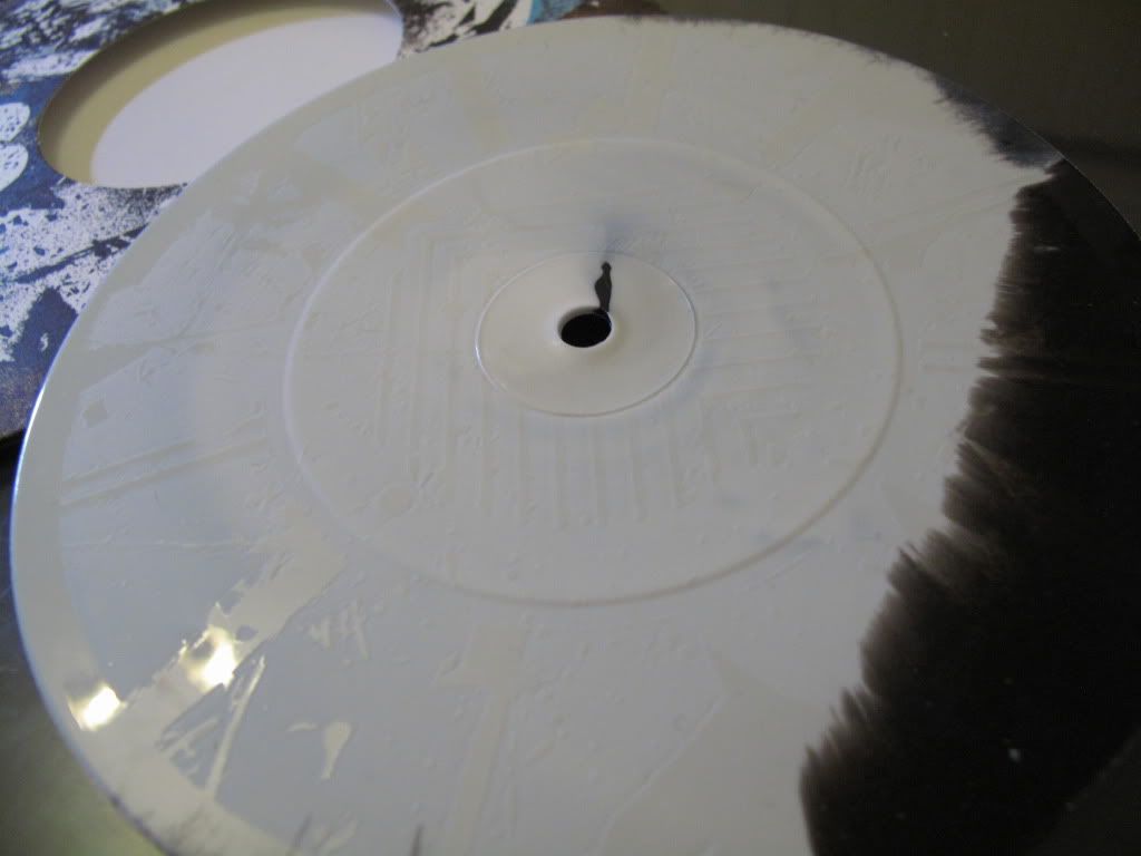
 One sided vinyl with the bands sun god dial logo thing laser etched into the B-side. No matrix sticker on the B. Pretty clean. You kind of get the idea with this photo.
 I've made points in the past about my lack of patience for Bannons repetitive artwork when it comes to modern Converge releases. Nate from the band in turn made the point (read the entire post and the comments) about the band concreting themselves an identity the same way Black Flag did in the 80's via the artwork and vision of Raymond Pettibon etc. His point is perfectly valid and I use my favourite Australian band Extortion as an example in favour of his argument sometimes. It's fair to say that that band can attribute a good chunk of it's popularity to it's aesthetic. I suppose there's a couple things that get my goat about Converge in response though; I just find Extortion and Black Flag album covers so much more interesting to look at, there's always something different going on, some new character in some sticky situation. Every single Converge release these days uses the same female model in it's layout, with the same paint splashes and layering. This 7" is a good example in that it certainly looks like it could have just been a single lifted from the previous LP. Same colours, same female model, same everything. The other thing that I have trouble with is that I just think the band are selling themselves short by using images of females in some sort of troubling pose etc. And a love heart? This isn't primary school poetry class. I like to imagine that Bannons lyrics and the bands general mission runs deeper than just the issue of girls, love and broken hearts etc.
 I would have preferred at least one extra track over a laser etching, but regardless, this is a tidy release. It's a little too polished for my liking though, but that's because I like it dirty. Although these days they may not be the biggest band in my life, it's safe to say that in the last 15 years, no other band has had such a profound influence on me terms of musical taste and just general outlook on the world. So while I may come across as a little whiney regarding this 7", I am appreciative and I hope the band continues with stuff like this.
 No inserts. All relevant information and the lyrics to the song are printed on the back. 3000 copies of this record were pressed, spread over three alternate colourways. 1000 for their recent european tour, 1000 for various distros around the world, and 1000 that were made available in the bands online store. I think that's how it went anyway? My copy is of the 1000 from their store. Black and white smudge type wax.
 One sided vinyl with the bands sun god dial logo thing laser etched into the B-side. No matrix sticker on the B. Pretty clean. You kind of get the idea with this photo.
 I've made points in the past about my lack of patience for Bannons repetitive artwork when it comes to modern Converge releases. Nate from the band in turn made the point (read the entire post and the comments) about the band concreting themselves an identity the same way Black Flag did in the 80's via the artwork and vision of Raymond Pettibon etc. His point is perfectly valid and I use my favourite Australian band Extortion as an example in favour of his argument sometimes. It's fair to say that that band can attribute a good chunk of it's popularity to it's aesthetic. I suppose there's a couple things that get my goat about Converge in response though; I just find Extortion and Black Flag album covers so much more interesting to look at, there's always something different going on, some new character in some sticky situation. Every single Converge release these days uses the same female model in it's layout, with the same paint splashes and layering. This 7" is a good example in that it certainly looks like it could have just been a single lifted from the previous LP. Same colours, same female model, same everything. The other thing that I have trouble with is that I just think the band are selling themselves short by using images of females in some sort of troubling pose etc. And a love heart? This isn't primary school poetry class. I like to imagine that Bannons lyrics and the bands general mission runs deeper than just the issue of girls, love and broken hearts etc.
 I would have preferred at least one extra track over a laser etching, but regardless, this is a tidy release. It's a little too polished for my liking though, but that's because I like it dirty. Although these days they may not be the biggest band in my life, it's safe to say that in the last 15 years, no other band has had such a profound influence on me terms of musical taste and just general outlook on the world. So while I may come across as a little whiney regarding this 7", I am appreciative and I hope the band continues with stuff like this.
No comments:
Post a Comment